Tableau is an amazing tool, with drag and drop functionality that makes it extremely easy to use. You can connect to an Excel file in 1 minute, build a chart in 2 minutes, and create a dashboard in 10. But, in a year from now will you know what your goal was? Will others on your team know how to support the workbook you created? Will your creation be easy to use by end users or feel trustworthy? Below are a handful of my favorite enterprise best practices for you to make the most out of your Tableau journey over the long run.
Setup:
Branded Color Palette
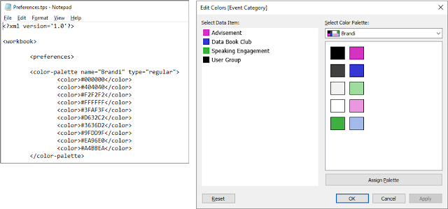
With a little bit of effort you can turn your organization's colors into a palette for use within Tableau. This post walks you through how to modify your Tableau preferences file to include corporate colors. Once created, you will need to disseminate it to other users, so consider making it part of your onboarding process.
Format at the Workbook Level
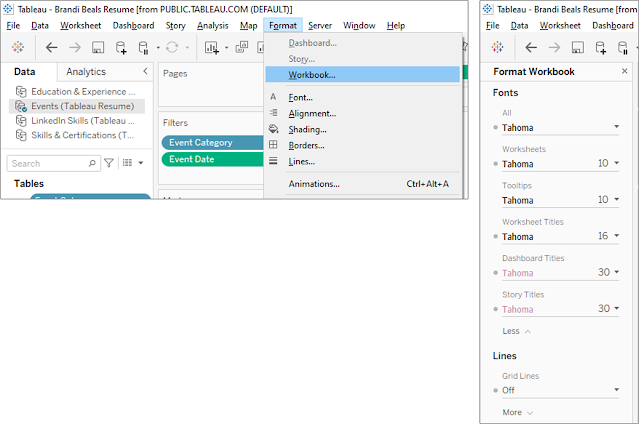
This is also a great time to work with your marketing department on creating a style guide for use in Tableau. The extra effort to apply standards to your dashboards shows that you care about what you are building. If you have taken the extra time to make your dashboard look "on brand", you have likely taken the extra time to validate the data and results, too. It also makes them look more professional and trustworthy. Personally, I like to apply this before building any charts because a lot of formatting on each individual sheet depends on the font, size, and colors already defined at the workbook level.
Define Data Fields
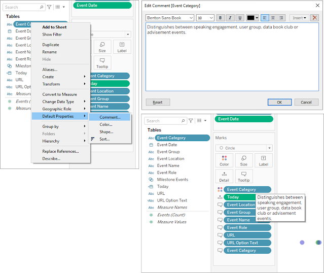
Adding comments, such as data definitions, to fields in the data pane make them easier to use, both now and in the future. This is especially useful if there is something not intuitive about the data set or if there are codes or acronyms as values. You can add a comment by right-clicking a field in the data pane and navigating to Default Properties > Comment. This comment is visible when hovering over the field either in the data pane or in a view.
Development:
Document Calculated Fields
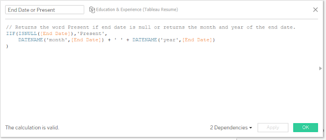
Another place to add comments is in calculated fields, using "//" as a prefix. This is especially helpful if you have written a complex calculation. Everything after the "//" will be a comment, so you cannot have any part of the calculation on the same line after the comment has started. Where needed, I will break up my calculation into pieces, with each bit commented.
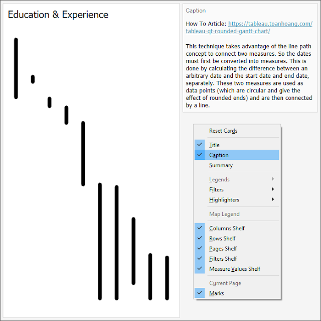
Use Captions to Leave Notes
A fairly unknown component of a view is the caption, which provides an automatically generated summary that describes the chart, by default. I like to turn this unused component into a place where I can leave myself or my team notes. These notes can be links to the inspiration for the chart, sources, or step-by-step instructions on how to modify the chart. Right-click anywhere on the light gray background of a view and toggle on the Caption box. Double click the text box and replace the automated text with any notes you want to leave.
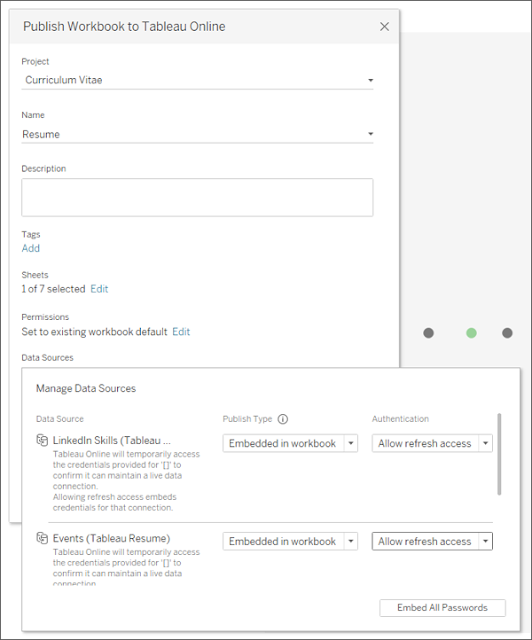
Allow Refresh Access
Once you have curated the data source, created the branded dashboards, and left your future self plenty of documentation, it is time to publish your masterpiece to either Tableau Server or Tableau Cloud (formerly known as Tableau Online). You should be using one of these technologies when working in an enterprise setting because they allow for waaaaay more automation and scalability. Depending on the data system you're getting data from, your screen may look different, but ultimately you want to give Tableau Server/Cloud the ability to get new data from that system on some regular basis.
Automation:
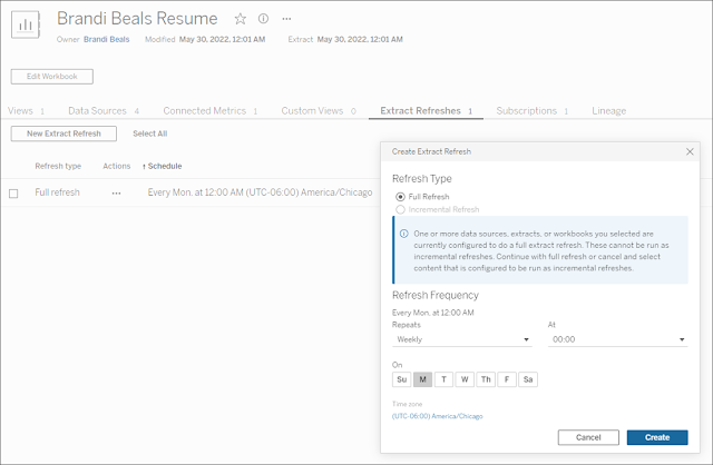
Refresh Data Extracts
Once published or during the publishing process, opt to refresh the data on a regular cadence. This will keep you from having to manually update your dashboard every day/week/month/etc. It will also ensure your dashboard is kept up-to-date with the latest data. The account that runs Tableau Server/Cloud will need access to the underlying source system, so check on that if you have issues.
Setup Subscriptions
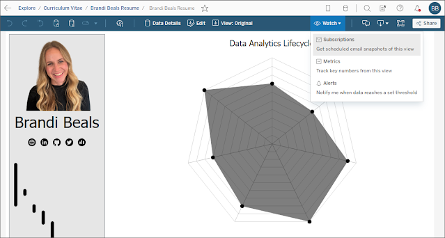
Even the best dashboards get used less over time. Unless the dashboard is part of a regular process, end users may forget it exists. An excellent feature that is native to Tableau Server/Cloud is the ability to send emails with a snapshot of a dashboard at a point in time. This increases user adoption of your work and keeps it top of mind. I have also used subscriptions to my advantage, by modifying my dashboards to showcase actionable information that entices end users to click on the snapshot to be taken to the live, interactive dashboard. Depending on the version of Tableau you are using, you can either click the Watch dropdown and select Subscriptions or click the Subscribe button along the top ribbon. Users can subscribe themselves or workbook owners can subscribe people on their behalf.
Create Metrics
In addition to subscriptions, end users or workbook owners can create metrics to track KPIs. Similar to subscriptions, there is a button at the top of the Tableau Server/Online interface that allows you to create a metric. A panel will open and prompt you to select a metric on the dashboard that it will use to generate the KPI. The metric will be saved as a separate object on Tableau Server/Online, though it is tied to the originating object. I believe metrics will start to become more popular in the near future, as they allow users to customize their experience in Tableau and see the data that matters most to them.Metadata:
Click Data Details
Another button at the top of a dashboard is one called Data Details. It is only visible if you have purchased the Data Management Add-On from Tableau. If you do not have this additional functionality yet, you should consider it. There are many reasons, which I will not cover now (it might be a future topic, so subscribe), but one of the major benefits is that it provides information to the end user about the dashboard. Author information, data source names and refresh dates, as well as those field definitions from earlier.
Utilize the Comments Pane
Often times, end users catch things we missed or they have questions. An easy way for them to provide feedback and ask questions is through comments. The comment button offers an easy way to have a conversation right where the data lives. Users can even include a screenshot, as of a point in time, to show what they are seeing.
Create an Ask Data Lens
If you really want to blow people's minds, consider creating an Ask Data Lens for any curated data source users may have ad hoc questions they want to ask. First, the data source needs to be published to Tableau Server/Cloud separately. Then, you need to create a new lens, which allows for additional curation.
