
Do you ever have one of those projects that you've always wanted to complete, but for all your trying, you are never able to finish? For the past 5 years, that project has been to create an interactive and visual version of my resume in Tableau. I've always had grand plans for it and I've spent significant time researching ideas, compiling data, and playing with some chart types in Tableau Desktop. But a final product has never materialized. Until now.

Let's break it down the things I've learned along the way. The first thing with building a resume in Tableau is collecting the data. The Excel file behind the workbook is comprised of 4 tabs: LinkedIn Skills, Skills & Certifications, Events, and Education & Experience. But really, you can structure the data in any way you want. It depends heavily on how you want to visualize the details of your resume. Here's the approach I took.
LinkedIn Skills
We've got some basic bar charts on the right side. These are simply the top 10 skills based on LinkedIn Endorsements, which brings up one the first hurdles: coming up with metrics for the dashboard. Rarely do we quantify things on our resume, so finding ways to do that can sometimes feel arbitrary. LinkedIn Endorsements made that bit easy, even though they may be skewed slightly (Alteryx should be higher and R should be lower).

I categorized expertise and technologies differently because there isn't necessary a tool associated with leadership. Maybe a better title would have been soft and hard skills. Because I wanted to limit each chart to the top 10 skills, I needed to add the category field as a context filter.
Skills & Certifications
The next hurdle I ran into was that I didn't want everything to be a bar chart! I mean, I love bar charts, but I was looking for a little variety... something to make my resume stand out. That's when I came across the coxcomb chart, but it didn't seem applicable to my data set (in hindsight, I was incorrect). Eventually I came to the spider or radar chart, which is a fantastic way to show skills in different aspects of data analytics and data science. In fact, because it's a circular graph, it would be conducive to the representation of a lifecycle. Most analytical projects follow a general process, and I have some amount of skill in each of those areas that I wanted to highlight.
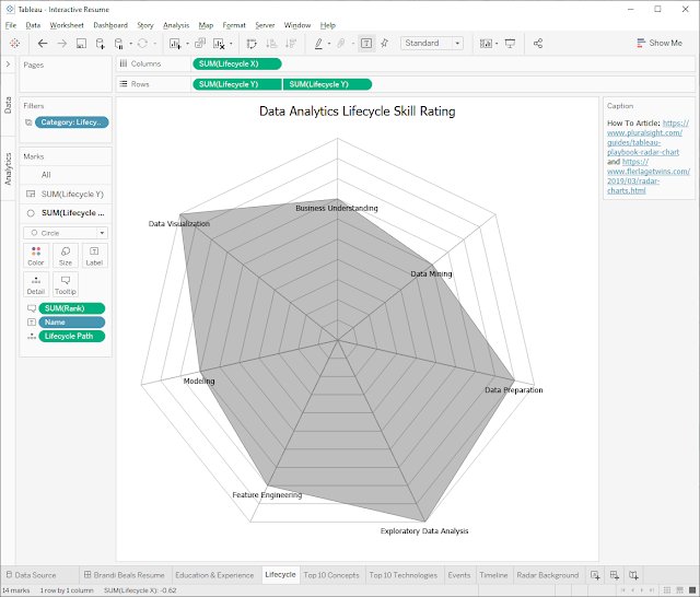
It's a complex chart type, though, and requires cosine, sine, and radian calculations. Ken Flerlage put together a great overview and template you can use and reverse engineer. He allows for a lot of flexibility and customization, which I found myself getting confused by. After a bit more research I came upon this article by Recnac, which has a much simpler calculation. For this use case, I wasn't expecting users to interact with the chart, so the bells and whistles weren't necessary. I did use Ken's template to create the background image map, though.
Events
Because of my passion for data and my involvement with the Tableau Community, I have quite a robust list of events I've had the honor of participating in. In my research and inspiration phase, I came across Ann Jackson's Tableau resume and was thoroughly impressed. It's the best I've seen! It's simple and clean, yet gets across all the relevant information. I particularly like how she visualized all her speaking engagements and community participation. It's wild to me that this section takes up so little space on her resume because it is beyond impressive.
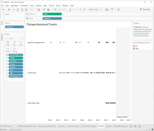
To be honest, there isn't a lot to this chart besides having a wealth of data. I did create a set to highlight certain milestone events (like speaking at Tableau Conference 2018) and I have a dashboard action to take users to a supplementary information page (like the recording from an event).
Education & Experience
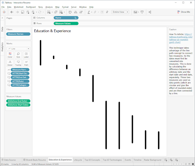
This chart was the easiest to conceptualize because we see it all the time. It's on our LinkedIn profiles and on our paper resumes. It's a timeline of every position you've held. I started with a gantt chart, which was okay. I tried creating a simple agenda-style chart as well, but that didn't do justice to the length of time I was at an organization. After some feedback from my wife, we both agreed that this minimal, vertical gantt chart was perfect. It visualized the timeline, while accounting for the length of time, and added an air of mystery to my final dashboard.
Iteration
I'm sure this won't be the last time I'll tinker with my Tableau resume, but I'm ecstatic to finally have a finished product. Hopefully my journey will help you build something even better!


