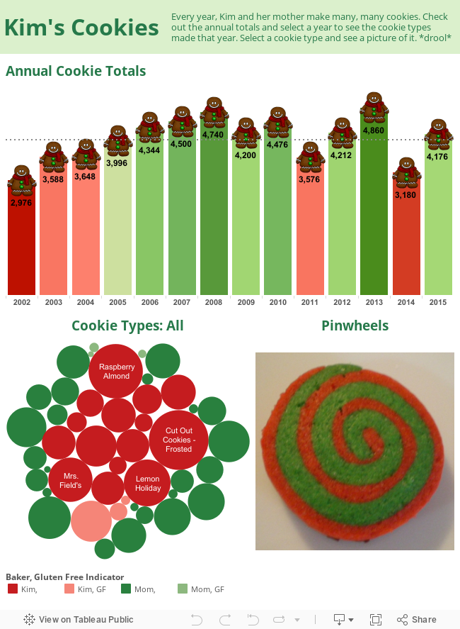
Kim, a woman at my office, makes a ridiculous amount of cookies each year around the holidays. It started as a simple bar chart with some gingerbread men sitting atop each bar, representing the number of cookies made over the years. Kim appreciated my chart, shared it with her mother who helps in the baking, and offered me cookies in return for my efforts.
When I stopped by her desk to retrieve my prize, she showed me a document she uses to track the types of cookies they make. Her document is used to track potential recipe improvements, but I saw the potential and asked her to send me the document along with the pictures of each cookie she mentioned she had.
Here is the result of her efforts and a few minutes of my time.